.png)
OTIF Report Automation: Saving ~4 Days a Month of Manual Work

Context
Our client, a $120 million construction supply manufacturer, relied on MAPICS as its ERP system. While MAPICS handled transactional processing well, it offered very limited reporting capabilities. Nearly all reports had to be manually exported and built in Excel. One of the most important reports for the operations team was OTIF (on-time in full), a measure of how often orders were shipped on the promised date and in the promised quantity.
The operations analyst responsible for OTIF reporting spent 5–8 hours each week pulling multiple datasets from MAPICS, cleaning them in Excel, and stitching them together with complex lookups. Split shipments and separate parcel data sets made the process particularly painful. Because of the effort required, the report was only produced weekly. The operations director, who was introducing daily stand-up meetings, wanted this report produced daily to better track service performance and investigate root causes.
Objectives
The objective of the project was to transform OTIF reporting from a weekly exercise into a daily management tool via automation. Specifically, the operations director wanted:
- Daily visibility into OTIF performance to use in stand-up meetings.
- An automated process to eliminate manual exports and Excel lookups.
- A dashboard that presented the results in a simple and actionable format.
Project Delivery
Building the Data Foundation
We began by replicating the critical data sets from MAPICS into a SQL-based data warehouse. This eliminated the need for manual exports and created a centralized foundation for analysis. The key datasets included:
- Sales order headers: contained the promised ship date, order number, and ordered quantities.
- Work order headers: linked sales orders to manufacturing work orders.
- Production data: provided batch numbers associated with each manufacturing order.
- Shipment details: mapped production batches to shipments and contained quantities shipped.
- Shipment headers: recorded the actual shipment dates.
By consolidating these datasets in one environment, we created a single source of truth for order and shipment activity.
Data Cleaning
Before applying logic, we applied filters to remove noise such as inter-company orders, which were irrelevant to customer service metrics. This ensured the results would reflect true customer-facing performance.
Rebuilding Lookup Logic in SQL
The core of the project was to replicate, in SQL, the manual lookup process that the analyst had previously maintained in Excel. Each relationship in the chain was carefully defined in SQL views:
- Start with cleaned sales orders.
- For each order, look up the manufacturing order in the work orders table.
- From there, find the batch numbers in the production data.
- Use shipment details to map each batch number to a shipment number.
- Join to shipment headers to retrieve actual shipment dates.
- Aggregate shipment records back to the order level. If an order had multiple shipments, the latest shipment date was used.
- Compare total quantities shipped to the order quantity to confirm whether the order was shipped in full.
This replaced fragile Excel VLOOKUP chains with structured joins that were automated, consistent, and easy to maintain.
Handling Complex Scenarios
The SQL logic also addressed the challenges that had made manual reporting so time-consuming:
- Split shipments: Orders fulfilled in multiple parts were aggregated and evaluated against the promised quantity, ensuring the “in full” portion of OTIF was accurate.
- Separate parcel shipments: Data from the parcel system was integrated alongside batch shipments, providing a complete picture of fulfillment.
- Data gaps and anomalies: Built-in checks flagged orders missing linkages or quantities, which could then be reviewed separately.
Building the Dashboard
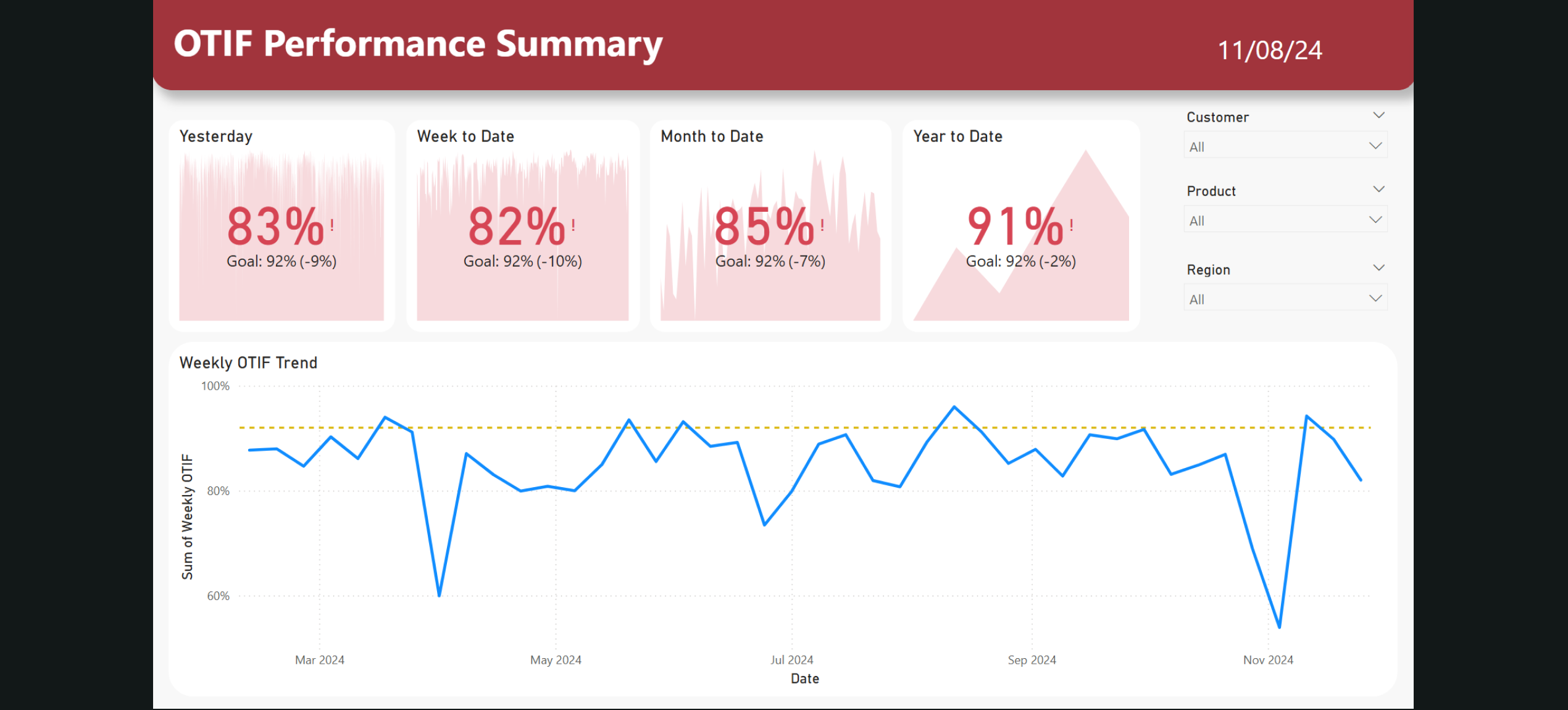
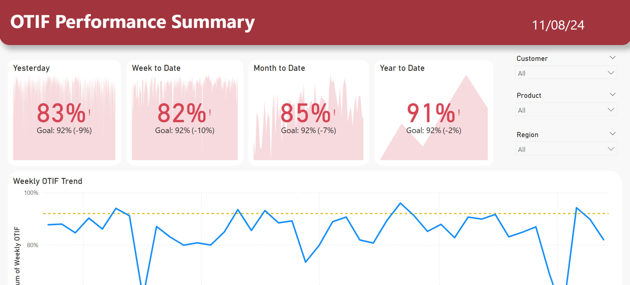
With the data pipeline in place, we designed a Power BI dashboard tailored to the operations director’s needs. Key features included:
- Daily OTIF percentage displayed prominently at the top of the dashboard.
- Trend analysis to show how OTIF performance had changed over time.
- Filters by customer, product line, or region to allow for drill-downs.
- Order-level detail views to support root cause analysis.
The dashboard gave the operations team a live, interactive tool they could bring into daily stand-ups, replacing the static weekly spreadsheet.
Automating Delivery
Finally, we automated the full workflow. The data warehouse refreshed nightly, the SQL views recalculated OTIF automatically, and Power BI refreshed early each morning. A weekly email summary was also scheduled to provide leadership with a snapshot of service performance.
Outcome
The project delivered immediate and measurable results:
- Daily reporting cadence. The operations team now reviews OTIF performance every morning, embedding the metric into daily stand-ups.
- 5–8 analyst hours saved weekly. The manual effort was eliminated, freeing the analyst for more value-added analysis.
- Improved accuracy. Automated SQL joins reduced errors that had previously slipped into Excel-based reporting.
- Stronger root cause analysis. With daily visibility, issues could be investigated and addressed in real time.
- Increased customer focus. OTIF became a central measure of service performance, reinforcing a culture of accountability.